


We will supply you with the tools to manage and maintain your website for years to come. Our web development team will make sure that all of your content is updated, well-structured, easy to read/find, search engine friendly, cross-device compatible, and user friendly.

It’s the ideal way to take your brand from a traditional brick & mortar store to an innovative and attractive one.
With our e-commerce services, we will make sure that all of our efforts are focused on making your website as successful as possible.

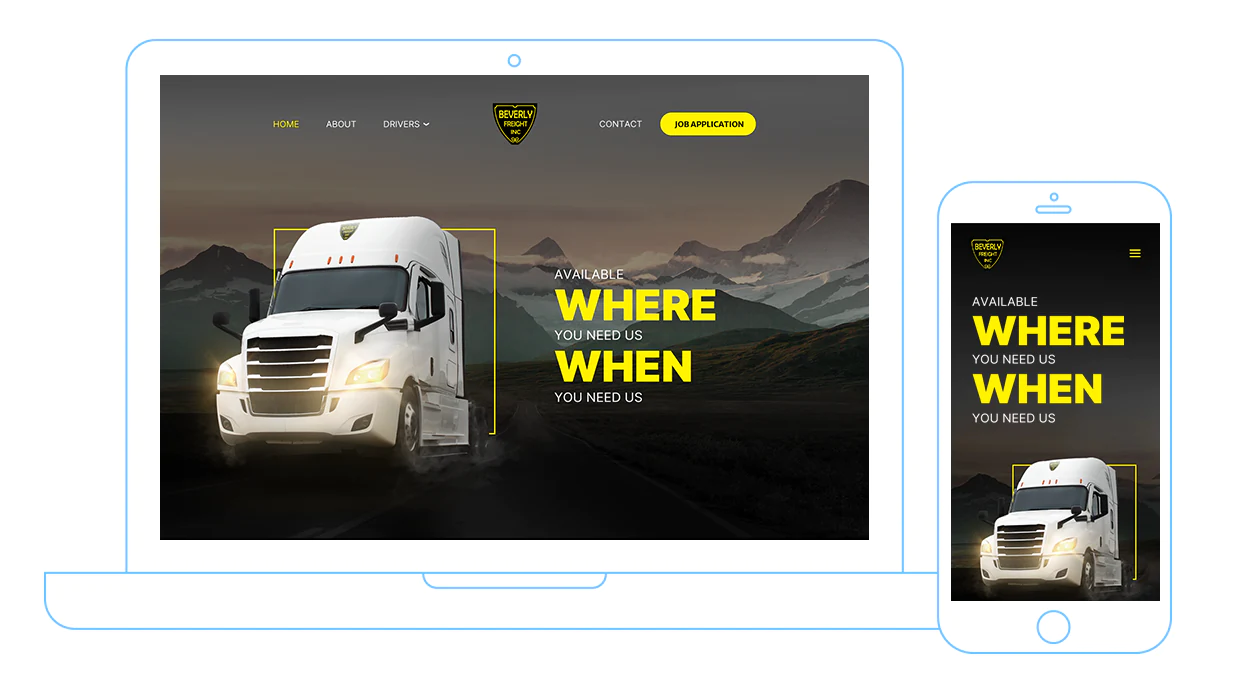
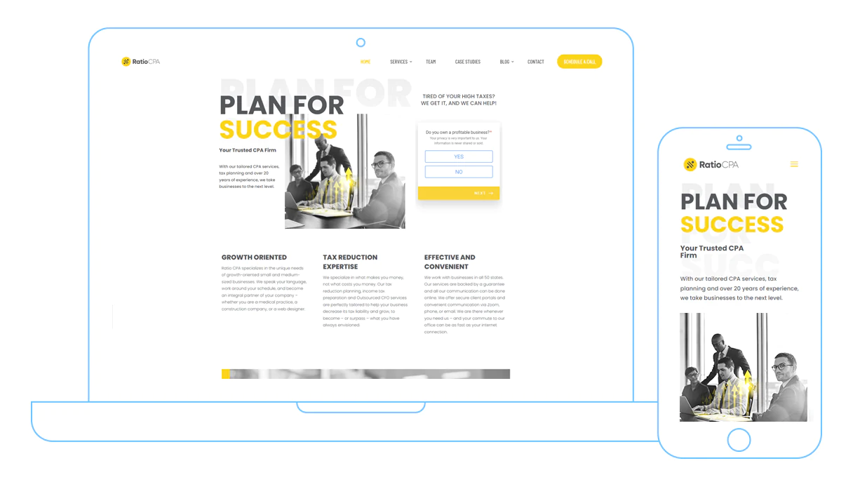
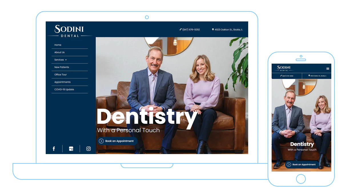
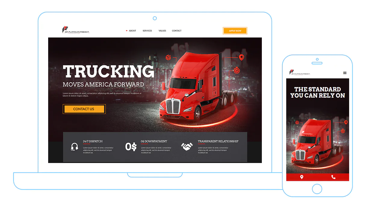
Inventive design can be a make-it or break-it factor in your website’s appeal. Choosing the right website design will give you a competitive edge over other companies.

A website redesign should be done every 3-5 years if you want to stay ahead of your competition. Consider redesign as a refreshment and tactic to make your website stand out from your competitors.

Our creative team will carefully craft content specifically designed for your image and brand. We know how to write engaging content that will grab your readers’ attention and potentially convert them into customers.

Websites need to be well-maintained in order to attract and retain customers, maintain search engine rankings, and present new information, products, and services to the public.

Depending on the quality of your SEO, your website could be ranked #1 on search engines such as Google, Yahoo, and Bing.